Coordinate Wall Colors and Fixtures for a Cohesive Bathroom
Written by SayBuild-admin // August 11, 2025 // Home Remodeling // Comments Off on Coordinate Wall Colors and Fixtures for a Cohesive Bathroom
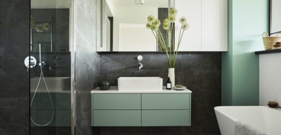
Bathroom design feels a lot simpler when wall colors and fixtures work together. Many homeowners run into problems by picking pieces one at a time without thinking about how everything will look together. The result is a bathroom that feels disjointed instead of thoughtfully put together. This guide shares practical ways to coordinate wall colors and fixtures for a cohesive bathroom that looks polished and feels intentionally designed.
Start With Fixtures
Fixtures often stick around longer than paint colors, so it makes sense to start there. Look closely at what’s already in place. Some fixtures have warm undertones like cream or almond, while newer ones tend to be cooler whites.
Pay attention to the finish as well. For example, brushed nickel tends to work well with cooler paint colors, while oil-rubbed bronze looks better with warmer walls.
Pick a Color Temperature
Color temperature shapes the entire mood of your bathroom. Warm colors, like beige, peach, or soft yellow, make small spaces feel more inviting. Cool colors, including soft gray, blue, or crisp white, create a cleaner, more open look. Neutrals give you the most flexibility and work well with different metal finishes and accent pieces.
Choosing the right color for a bath wall surround becomes easier when you think about whether your space should feel cozy or airy.
Pay Attention to Natural Light
A color that looks great under store lighting might feel totally different at home. North-facing bathrooms get cooler, indirect light, which can make even warm tones seem dull. South-facing rooms bring in lots of light and can brighten up almost any color, but strong light can also make bold hues feel overwhelming.
Before committing, test a few colors at different times of day to see how natural light affects them, since even small shifts in lighting can change the overall look.
Watch for Undertones
Undertones are the subtle hues behind the main color. They can make or break your color pairing. Cool-toned fixtures look best with wall colors that have blue, green, or violet undertones. Warm-toned fixtures pair well with colors that lean toward yellow, red, or orange.
Hold paint samples next to your fixtures and view them in your bathroom lighting to catch any mismatches early.
Use the 60-30-10 Rule
The 60-30-10 rule keeps the room visually balanced. Use one main color (usually the wall color or the shower/tub surround) for 60 percent of the room. A secondary color, like the tone of your fixtures, accent walls, or large accessories, makes up 30 percent. Then, use the final 10 percent for accent colors like bold decor, artwork, or towels.
Final Thoughts
Treating colors and fixtures as a team creates a bathroom that looks like it was professionally designed. Take the time to test combinations and notice how they interact with your lighting and space. When in doubt, simplify.
By taking a step-by-step approach, it becomes easier to coordinate wall colors and fixtures for a cohesive bathroom. Focus on balance, trust your eye, and don’t be afraid to swap out one element if it’s not working.
Image Credentials: By FollowTheFlow, #444937699


 If you want to contribute tutorials, news or other money-related stuff:
  Share our home building library with your facebook friends:
  Do you have any ideas or suggestions you would like to make?
  If you like what we do, please subscribe to our
  All content Copyright © 2012 SayBuild. Part of nBuy Home Management Network.